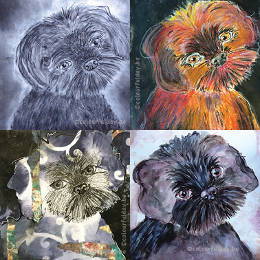
 My art-journal is a place for random fun, making notes, and this time also the place for a little 'experiment'. I wanted to draw the same dog a couple of times, but each time with another technique. So say 'hi' to Tjeuke, he is the dog-model in this blogpost. It's the cute little dog from one of my Facebook followers! I'm curious which drawing you like te most?! Mijn art-journal is ene plaats voor gewoon wat fun, het maken van aantekeningen en deze keer ook voor een klein 'experiment'. Ik wilde hetzelfde hondje een paar keer tekenen, maar dan iedere keer andere materialen gebruiken. Dus zeg maar 'hallo' tegen Tjeuke, hij is het model van dienst in dit blogbericht. Het is het schattige handje van een van mijn Facebook volgers. Ik ben benieuwd welke tekening jullie het leukste vinden?!  This first time I was just experimenting a bit by using a black fineliner, paper scraps, acrylic paint, a stencil and a white gelpen. I started with the center of the face in black fineliner and than used the negative painting technique for the black acrylic background. De eerste keer was ik gewoon wat aan het experimenteren met zwarte fijnschrijver, restjes papier, acrylverf, stencil en een witte gelpen. Ik begon met het tekenen van het gezichtje in zwarte fijnschrijver en daarna schilderde ik de negatieve ruimte rond het hondje met zwarte acrylverf. 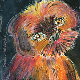 Than I saw a lifestream from Christy Sobolewsky on youtube where she uses oil pastels. Also fun to try, especially because I didn't use this medium for a long time. Since I don't have a lot of oil pastels, I chose some not obvious colours. Maybe it is a good idea to make an underpainting next time, because blending the colours was very painful for my hands. Daarna was ik een lifestream van Christy Sobolewski op Youtube aan het bekijken waar ze wasco's gebruikte. Ook leuk op eens te proberen, zeker omdat het heel lang gelden was dat ik hier nog mee gewerkt had. Omdat ik niet zo veel verschillende kleuren en tinten wasco's heb, koos ik voor een beetje aparte kleuren. Misschien dat ik in het vervolg wel beter een acryl onderschildering maak, want dit was nogal pijnlijk voor mijn handen om zo'n 'groot' oppervlak te blenden. 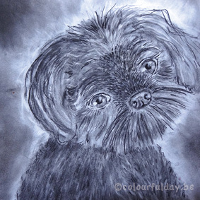 After the color explosion in the previous drawing, time for some quiet colours and just using pencil. It's a bit of a challenge to keep the eyes really white, because before you know it, your hands are black from the pencil and you rub it all over your page! Fortunately now the drawing is finished, I used a 'fixative' spray, so all the pencil lines are staying where they should be. If you are curious how I draw the highlights in the hair, go to Serkan Yener explanation in the youtube video 'how to draw realistic hair -3 easy steps'. Na de kleuren explosie van vorige tekening, is het tijd voor wat rustige kleuren en gebruik ik alleen potlood. Het is een beetje een uitdaging om het wit van de ogen echt wit te houden, want voor je het weet zit je hand vol met potlood en wrijf je dat ongewild over heel je pagina uit! Nu de tekening af is heb ik gelukkig een 'fixatief' spray gebruikt, dus de potloodlijnen blijven nu netjes waar ze horen! Als je benieuwd bent hoe ik de highlights in de haren tekende, ga dan zeker eens kijken naar de uitleg van Serka Yener in de youtube video 'how to draw realistic hair- 3 easy steps'. 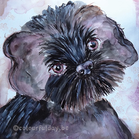 The last drawing with Tjeuke: a little bit more colour than the pencil drawing, but not as flashing colours as I used with the oil pastels. This time I used ink and at the background you see some little flowers (clear stamp). So now you have seen the 4 drawings...which do you like the most? De laatste tekening met Tjeuke: iets meer kleur dan bij de potlood tekening, maar niet zo'n felle kleuren als zijde wasco's. Deze keer heb ik inkt gebruikt en op de achtergrond zie je nog een paar kleine bloemetjes (stempel).
Nu dat je alle vier de tekeningen gezien hebt....welke vind jij het leukste? 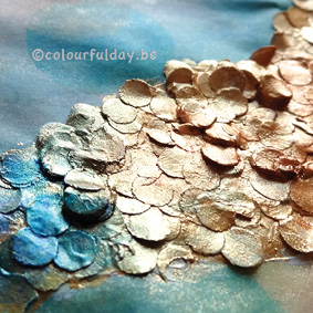 background technique with little paper circles Is your hole puncher full with paper? Don't throw it in the trash, but make this fun background with it! I made this page a while ago for a background- swap. I thought it would be fun to share with you how I made it. Zit je perforator vol met papier? Gooi het dan niet meteen in de prullenbak, maar maak deze leuke achtergrond ermee! Ik maakte deze pagina een hele tijd geleden voor een ruilproject van achtergrond- technieken. Het leek me leuk om met jullie te delen hoe ik het gemaakt heb. (De Nederlandse instructies staan helemaal onderaan) Materials that I used: Paper A lot of little paper circles from your hole puncher Yellow and blue ink (or use acrylic paint with water), Acrylic paint: gold Distress stain 'rusty hinge' White gesso Water (in a spray bottle) (Self made) Stencil with circles Little sponge Steps to do: 1. Paint a few yellow circles ( with a sponge) by using your stencil and yellow ink. 2. Replace your stencil and repeat with blue ink. Allow it to dry. 3. Wet the paper and add a transparant wash over the entire page with distress stain. Allow it to dry again. 4. Add a thick layer gesso, in a nice curvy shape. 5. Add the little paper circles to the gesso ( thick layer) and fixate them with an extra layer of gesso, use your fingers or a stiff brush. Alow to dry. 6. Add the golden paint to the curve of circles 7. Add blue ink to the left bottom, distress stain in the middel and yellow ink on te top of the shape of circles. Where two colours meet, mix them a bit so you get a smooth transition. Let dry. 8. Add more ink on a few places, to empasize the structure.. 9. Cutt off the circles that are crossing over the page 10. Add a final wash with ink and water to the background: yellow in the right bottom corner, blue against the paper circles and distress stain in the left upper corner. 11. Let dry and your background is ready! Have fun! 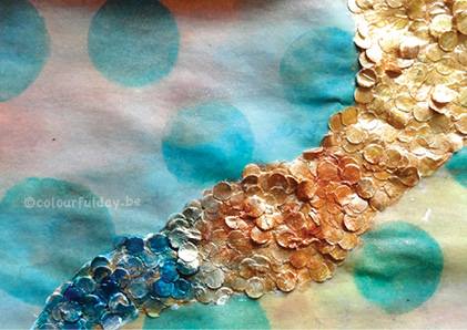 Materialen die ik gebruikte: Papier Papieren cirkels uit je perforator (heel veel) Gele en blauwe inkt (of gebruik acrylverf met water), Gouden acrylverf Distress stain ‘rusty hinge’ Witte gesso Water (in een spuitflesje) Stencil met cirkels (zelf gemaakt) Sponsje Aan de slag: 1. Maak een paar gele cirkels, gebruik daarvoor je stencil, gele inkt en een sponsje. 2. Verleg je stencil en herhaal stap 1 met de blauwe inkt. Laat het drogen. 3. Spuit het papier een beetje nat en voeg een transparante laag over de hele pagina met de distress stain. Laat het opnieuw drogen. 4. Smeer een dikke laag gesso in een mooie vloeiende dikke vorm. 5.Leg een dikke laag papieren cirkels in de gesso en fixeer alles met nog een extra laagje gesso eroverheen. Je kunt daarvoor je vingers gebruik of een penseel. Laat alles terug drogen. 6. Verf met goud over de papieren cirkels 7. Ga daarna met blauwe inkt over de linker onderkant van de papieren cirkels, met de distress stain in het midden en met de gele inkt over de rechter bovenkant van de cirkels. Waar twee kleuren elkaar ontmoeten, meng je ze een beetje zodat je een mooie overgang krijgt. Weer laten drogen. 8. Om de structuur van de papieren cirkels nog extra te benadrukken kun je op een paar plaatsen nog wat extra inkt toevoegen. 9. Knip de papieren cirkels die over de rand van het papier steken af. 10. Tot slot heb ik nog een laatste transparante laag over heel de achtergrond gedaan: gele inkt in de rechter benedenhoek, blauwe inkt tegen de papieren cirkels en de distress stain in de linker bovenhoek. 11. Alles goed laten drogen en...klaar!! Veel plezier ermee! 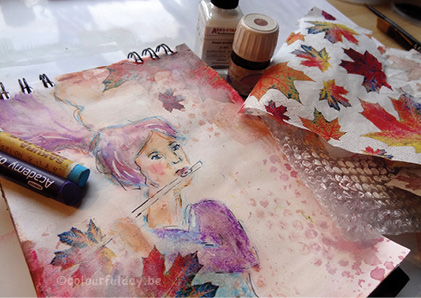 Inspired by the lifestream from Christy: If you don't like your art- journal page, then paint over it. So I painted over an 'ugly' sketch with a thin layer of gesso and made this page more 'beautiful' with the stuff that was stilll laying on my tabel: a napkin, ink, oil pastels and bubble wrap.
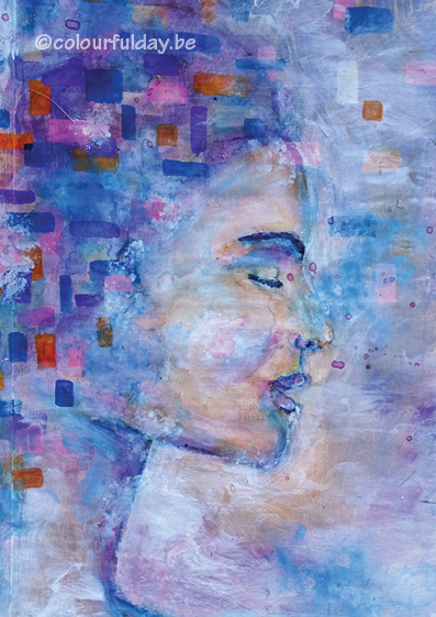
Geïnspireerd door de lifestream van Christy: als je een art-journal pagina niet mooi vindt, verf er dan overheen. Zo gezegd, zo gedaan! De 'lelijke' ruwe schets bedenkt met een dun laagje gesso en er dan nog iets 'mooiers' van gemaakt met de spulletjes die nog op mijn tafel rondzwierven: een servet, inkt,wasco's en bubbeltjes plastic. 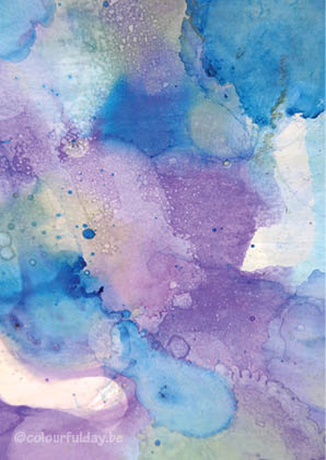 Experimenting with ink and alcohol drops...pure fun!
I love the transparency and the randomness of the colour patterns. Maybe suitable for the new book cover that I am designing? Aan het experimenteren met inkt en alcohol druppels...pure fun! Ik hou van dit transparante gevoel en de random kleurpatronen die ontstaan. Wie weet is het geschikt voor de nieuwe boekcover die ik aan het ontwerpen ben? |
Art journaling and mixed-media-art are for me a creative way to relax.
It's a place ( in contrast to everyday life), where I don't overthink everything and it doesn't have to be perfect. I just start to draw, play with different materials, write something and then see what's happening. It’s a wonderful flow! It's a Colourful Day! Archives
April 2022
Categories
All
|
 RSS Feed
