 It's always a surprice what will appear when you are playing with intuitive painting techniques. These little creatures came to say hello when I was experimenting with crayons.  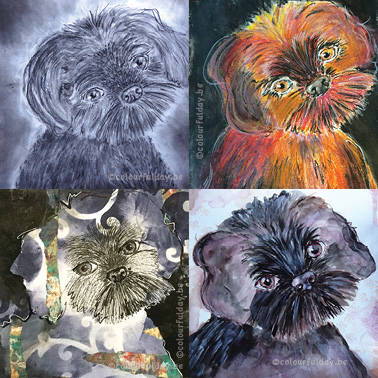 My art-journal is a place for random fun, making notes, and this time also the place for a little 'experiment'. I wanted to draw the same dog a couple of times, but each time with another technique. So say 'hi' to Tjeuke, he is the dog-model in this blogpost. It's the cute little dog from one of my Facebook followers! I'm curious which drawing you like te most?! Mijn art-journal is ene plaats voor gewoon wat fun, het maken van aantekeningen en deze keer ook voor een klein 'experiment'. Ik wilde hetzelfde hondje een paar keer tekenen, maar dan iedere keer andere materialen gebruiken. Dus zeg maar 'hallo' tegen Tjeuke, hij is het model van dienst in dit blogbericht. Het is het schattige handje van een van mijn Facebook volgers. Ik ben benieuwd welke tekening jullie het leukste vinden?!  This first time I was just experimenting a bit by using a black fineliner, paper scraps, acrylic paint, a stencil and a white gelpen. I started with the center of the face in black fineliner and than used the negative painting technique for the black acrylic background. De eerste keer was ik gewoon wat aan het experimenteren met zwarte fijnschrijver, restjes papier, acrylverf, stencil en een witte gelpen. Ik begon met het tekenen van het gezichtje in zwarte fijnschrijver en daarna schilderde ik de negatieve ruimte rond het hondje met zwarte acrylverf. 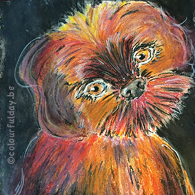 Than I saw a lifestream from Christy Sobolewsky on youtube where she uses oil pastels. Also fun to try, especially because I didn't use this medium for a long time. Since I don't have a lot of oil pastels, I chose some not obvious colours. Maybe it is a good idea to make an underpainting next time, because blending the colours was very painful for my hands. Daarna was ik een lifestream van Christy Sobolewski op Youtube aan het bekijken waar ze wasco's gebruikte. Ook leuk op eens te proberen, zeker omdat het heel lang gelden was dat ik hier nog mee gewerkt had. Omdat ik niet zo veel verschillende kleuren en tinten wasco's heb, koos ik voor een beetje aparte kleuren. Misschien dat ik in het vervolg wel beter een acryl onderschildering maak, want dit was nogal pijnlijk voor mijn handen om zo'n 'groot' oppervlak te blenden. 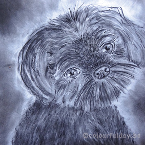 After the color explosion in the previous drawing, time for some quiet colours and just using pencil. It's a bit of a challenge to keep the eyes really white, because before you know it, your hands are black from the pencil and you rub it all over your page! Fortunately now the drawing is finished, I used a 'fixative' spray, so all the pencil lines are staying where they should be. If you are curious how I draw the highlights in the hair, go to Serkan Yener explanation in the youtube video 'how to draw realistic hair -3 easy steps'. Na de kleuren explosie van vorige tekening, is het tijd voor wat rustige kleuren en gebruik ik alleen potlood. Het is een beetje een uitdaging om het wit van de ogen echt wit te houden, want voor je het weet zit je hand vol met potlood en wrijf je dat ongewild over heel je pagina uit! Nu de tekening af is heb ik gelukkig een 'fixatief' spray gebruikt, dus de potloodlijnen blijven nu netjes waar ze horen! Als je benieuwd bent hoe ik de highlights in de haren tekende, ga dan zeker eens kijken naar de uitleg van Serka Yener in de youtube video 'how to draw realistic hair- 3 easy steps'. 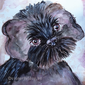 The last drawing with Tjeuke: a little bit more colour than the pencil drawing, but not as flashing colours as I used with the oil pastels. This time I used ink and at the background you see some little flowers (clear stamp). So now you have seen the 4 drawings...which do you like the most? De laatste tekening met Tjeuke: iets meer kleur dan bij de potlood tekening, maar niet zo'n felle kleuren als zijde wasco's. Deze keer heb ik inkt gebruikt en op de achtergrond zie je nog een paar kleine bloemetjes (stempel).
Nu dat je alle vier de tekeningen gezien hebt....welke vind jij het leukste? My art-journal is certainly also a place where I test colours, make small notes and where I'm trying out different things! 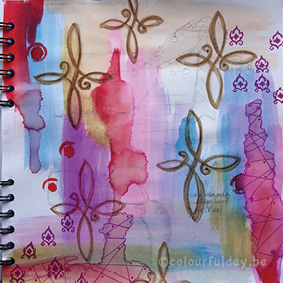 Mijn art-journal is zeker ook een plaats waar ik kleuren test, kleine aantekeningen maak en dingen uitprobeer!
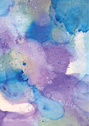 Experimenting with ink and alcohol drops...pure fun!
I love the transparency and the randomness of the colour patterns. Maybe suitable for the new book cover that I am designing? Aan het experimenteren met inkt en alcohol druppels...pure fun! Ik hou van dit transparante gevoel en de random kleurpatronen die ontstaan. Wie weet is het geschikt voor de nieuwe boekcover die ik aan het ontwerpen ben? Video Virgin So you know my art journal is a place to play and try new things ... It defenitely is this time! Not only IN my journal, where I was testing how I could easy use an old T- shirt in it, but also OUTSIDE it: Because this video-shy-girl did have the courage to hit the record button, wrestled with and editing program, warns you for new, self made, English words and crossers her fingers that doing a voice-over ( how weard is it to talk to yourself and hear your own voice!) will get easier if she does it more often! But: she survived! And is now curious about your opinion. What do you think of this camera position? And if you want to see more of this types of video's, don't forget to hit the like button Of course, other comments and tips are also welcome for this no-longer-video-virgin-girl. Have a Colourful Day! Video Verlegen Zoals jullie weten is mijn art-journal een plaats om nieuwe dingen te proberen... En dat is het zeker deze keer! Niet alleen IN mijn boek waar ik aan het testen was hoe ik een oud T- shirt kon gebruiken , Maar ook er BUITEN: Want alhoewel ik nogal video-verlegen ben, Heb ik toch op de opname-knop durven duwen . Na wat geworstel met het video programma En wat gegoochel met woorden ( hoe raar is het om tegen jezelf te praten en daarna je eigen stem terug te horen) Is het uiteindelijk gelukt! Ik ben dus nu benieuwd naar jullie reacties: Is dit b.v een goeie plaats voor de camera? En vergeet zeker niet om dit berichtje te 'liken', als je graag meer van dit soort fimpjes ziet. Have a Colourful Day! Ok, so the card with the birds and the quote that I posted last time did seem ok, didn't it? My inner critic however wasn't happy and I'll tell you why. The card was inspired by a YouTube tutorial from ART TV by Fantasvale (valentine's day gift idea: cosmic love watercolor tutorial with masking fluid). When I did everything 'exactly' the same as she did, with a very different result, I was a little dissapointed. And I know, I know ! It often looks stunning or easy when somebody else paints something, and it isn't always wise for your motivation to compare your own work with others, yet I was convinced I could do a better job. So I wondered what went wrong...time for a second attempt. Heb je het kaartje met de vogeltjes en de spreuk gezien van vorige keer? Best leuk, vind je ook niet ? En toch ben ik er helemaal niet zo blij mee, en ik zal je uitleggen waarom. Het kaartje was geïnspireerd op een you tube video van ART TV van Fantasvale (valentine's day gift idea: cosmic love watercolor tutorial with masking fluid). Dus toen ik 'alles' precies hetzelfde deed als zij, maar het resultaat helemaal anders uitzag, was ik wel wat teleurgesteld. En ja, ja! ik weet wel dat het op video vaak fantastisch of heel gemakkelijk uitziet als iemand anders iets schildert, en het niet goed is voor je motivatie om je te vergelijken met andere artiesten, maar toch was ik ervan overtuigd dat ik beter kon. Op zoek dus naar de oorzaak bij poging 2. 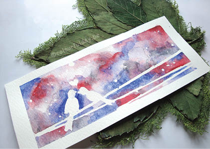 Second attempt...still struggling with blending Nope, still struggling with the colours and now it was very clear that my water did evaporate too quickly: The colours didn't get the chance to blend nicely. It wasn't hard to find the cause: The temperature outside was around 39 ° C! This temperature is not the best friend of the watercolour paint, but apparently I decided to ignore this conveniently when I searched my watercolor stuff together (because hey, when a girl wants to paint, she wants to paint NOW!) My attempt to keep my page wet by spraying some water on it did also fail. The water gets under your tape, so bye bye to nice clean white borders round your painting. Helaas, nog steeds een hele worsteling met het blenden van de kleuren. Maar nu zag ik wel duidelijk waaraan het lag: het water waarmee ik het blad nat maakte droogde veel te snel op! De oorzaak moest niet ver gezocht worden, het was buiten immers rond de 39°C! Deze temperatuur is niet de beste vriend van de aquarelverf, maar dat besloot ik blijkbaar gemakshalve te negeren toen ik mijn aquarel spullen bij elkaar zocht. (Want als het kriebelt om te schilderen, dan wil ik ook NU schilderen!) De poging om mijn blad nat te houden door er tussendoor water op te spuiten liep trouwens ook alleen maar op een knoeiboel uit. Het water wringt zich dan namelijk ook onder je afplakte om mooie witte randen te krijgen... 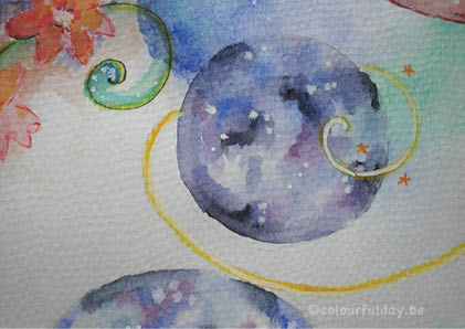 3rd time...good time! So I tempered my enthusiasm to paint NOW and I must confess that for a second I wished the weather would turn. But the next second I realized this would be absolutely crazy ... because who doesn't want good weather on vacation and I love the sun! But anyway...
A week later and back home : Third time good time. 'Goodbye' to the good weather, but 'hello' to my watercolours and 'hello' to a nice cosmic sky! Applause for bad weather! Mijn enthousiasme om NU te schilderen borg ik dus maar weer op en ik moet bekennen dat ik een seconde nog wenste dat het weer omsloeg. Maar gelukkig besefte ik de seconde daarna dat dat wel helemaal zot zou zijn...ik was immers op vakantie en ik hou van de zon! Maar goed... Een week later en terug thuis: derde keer, goeie keer! De temperatuur was nog maar een schim van de week voordien, dus tijd om mijn verfspullen nog eens boven te halen. En ja! daar verscheen eindelijk een mooie kosmische hemel! Applaus voor slecht weer! 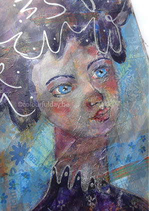 'Layer on top of layer on top of layer...on top of layer'
This art journal page has a lot of layers (acrylic pain, paper, napkins, marker,...). And when you love to experiment, you want to try everything on your page...even wax for your furniture! Not really recommended to use again, but if you keep going, layer after layer, you get a...let me say 'special' result Laagje boven laagje boven laagje...boven laagje' Op foto kun je het niet goed zien, maar deze bladzijde uit mijn art-journal heeft heel veel laagjes (acryl verf, papiertjes, servetten, pen,...). En ja, als je graag experimenteert zie je in alles wel iets dat je op je blad kunt smeren...zelfs boenwas! niet echt een aanrader om nog een keer te gebruiken, maar als je maar laagje boven laagje boven laagje blijft doorgaan krijg je uiteindelijk toch ...ehm...een speciaal resultaat zullen we dan maar zeggen. |
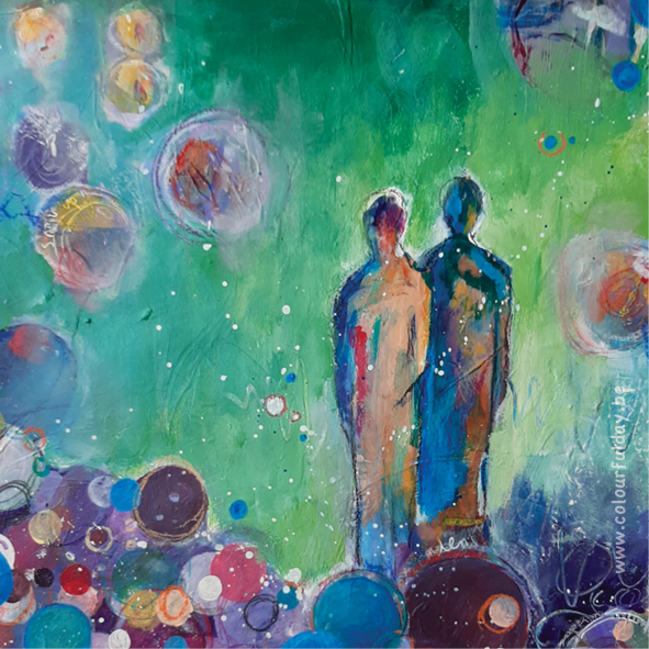
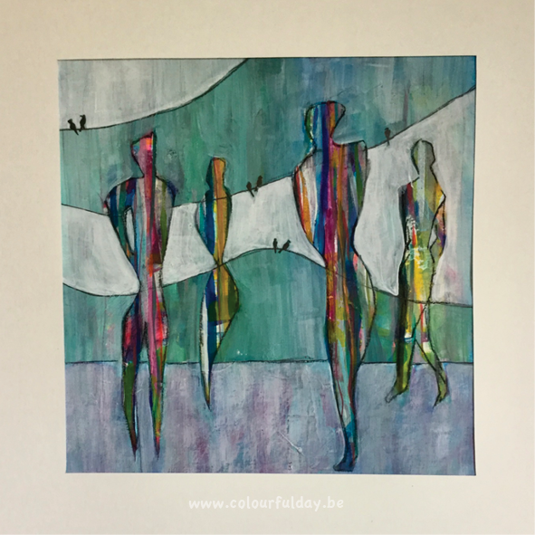
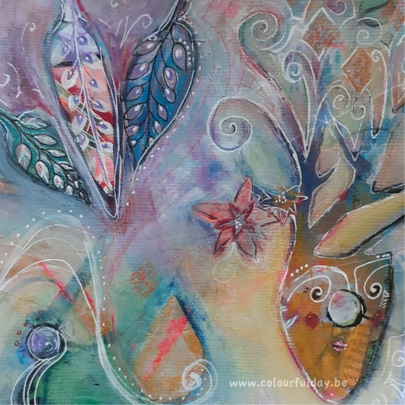
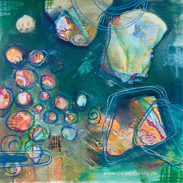
Art journaling and mixed-media-art are for me a creative way to relax.
It's a place ( in contrast to everyday life), where I don't overthink everything and it doesn't have to be perfect. I just start to draw, play with different materials, write something and then see what's happening. It’s a wonderful flow! It's a Colourful Day! Archives
April 2022
Categories
All
|
 RSS Feed
